SELF-INITIATED / HOSPITALITY BRAND CONCEPT
MOUNTAIN BREW
HIDEAWAY

A PLACE WITH A TONE
A self-initiated brewery concept built around a remote-cabin point of view, carried from the core mark into packaging, glassware, and merchandise.
THE PROJECT
THE PROJECT
Mountain Brew Hideaway is a self-initiated brand concept built around a small-batch brewery tucked deep in the mountains.
Mountain Brew Hideaway is a self-initiated brand concept built around a small-batch brewery tucked deep in the mountains.
Mountain Brew Hideaway is a self-initiated brand concept built around a small-batch brewery tucked deep in the mountains.
Self-initiated concept — creative direction, identity, packaging direction, illustration, mockups, and brand applications.
Self-initiated concept — creative direction, identity, packaging direction, illustration, mockups, and brand applications.
Earthy tones, hand-drawn texture, and layered type build a brand that feels lived-in but fresh — trail maps and remote-cabin cues instead of generic mountain clichés. Every piece, from the logo to the merch, supports the same idea: escape the noise and find your own hideaway, one pour at a time.
Earthy tones, hand-drawn texture, and layered type build a brand that feels lived-in but fresh — trail maps and remote-cabin cues instead of generic mountain clichés. Every piece, from the logo to the merch, supports the same idea: escape the noise and find your own hideaway, one pour at a time.
THE VISUAL FAMILY
THE VISUAL FAMILY
LOGO SYSTEM, PACKAGING CONCEPTS, SIGNAGE DIRECTION, GLASSWARE/COASTER MOCKUPS, MERCHANDISE CONCEPTS
LOGO SYSTEM, PACKAGING CONCEPTS, SIGNAGE DIRECTION, GLASSWARE/COASTER MOCKUPS, MERCHANDISE CONCEPTS
LOGO SYSTEM, PACKAGING CONCEPTS, SIGNAGE DIRECTION, GLASSWARE/COASTER MOCKUPS, MERCHANDISE CONCEPTS

FROM BADGE TO PACKAGE
The identity had to feel discovered, not decorated.
The identity had to feel discovered, not decorated.
The identity had to feel discovered, not decorated.
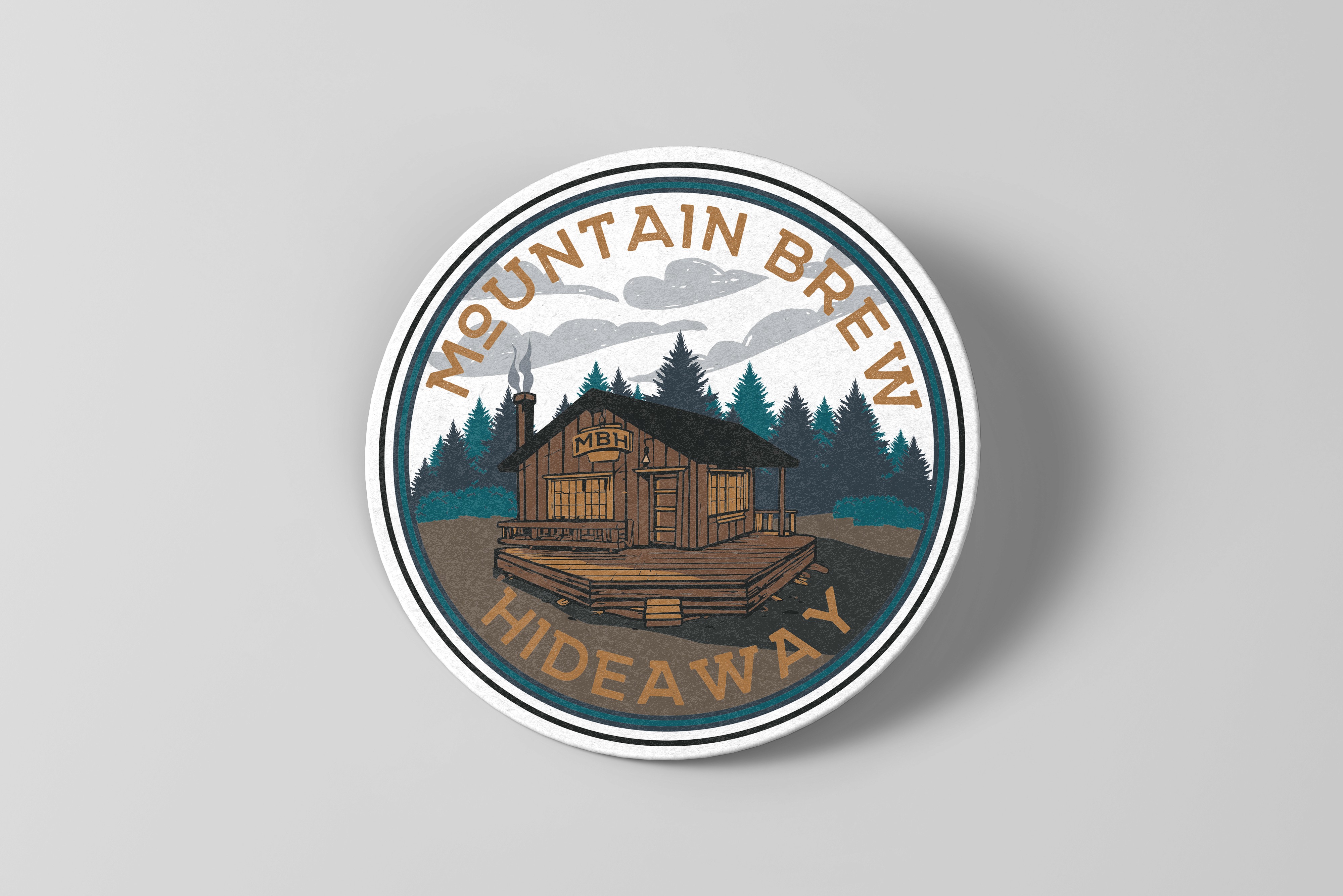
Cabin, trail-map, and field-guide cues shaped a compact badge system with enough texture to feel lived in and enough discipline to hold together across cans, carriers, coasters, glassware, and merch.
Cabin, trail-map, and field-guide cues shaped a compact badge system with enough texture to feel lived in and enough discipline to hold together across cans, carriers, coasters, glassware, and merch.


CONCEPT NOTE
A brewery that never existed, built like it always had.
A brewery that never existed, built like it always had.
PACKAGING + APPLICATIONS
