SELF-INITIATED PRODUCT / STRATEGY TO DEPLOYMENT
OHSHT
BETA APP

MAKE THE URGENT THING OBVIOUS
A blunt idea became a live community utility — named, designed, built, tested, and shipped end to end.
SELF-INITIATED PRODUCT / STRATEGY TO DEPLOYMENT
OHSHT
BETA 2.7.1
MAKE THE URGENT THING OBVIOUS
A blunt idea became a live community utility — named, designed, built, tested, and shipped end to end.
THE PROJECT
THE PROJECT
OhSht began as a blunt idea: when someone needs a restroom, the interface should get out of the way.
OhSht began as a blunt idea: when someone needs a restroom, the interface should get out of the way.
OhSht began as a blunt idea: when someone needs a restroom, the interface should get out of the way.
Self-initiated product — product strategy, naming, identity, UX/UI, responsive frontend development, data integration, QA, and deployment.
Self-initiated product — product strategy, naming, identity, UX/UI, responsive frontend development, data integration, QA, and deployment.
Start with the fastest useful action, then earn complexity. I designed the core journey around map, list, detail, and Find One Now; built a visual language that makes quality and status readable at a glance; and added community tools only where they improve the next person’s decision.
Start with the fastest useful action, then earn complexity. I designed the core journey around map, list, detail, and Find One Now; built a visual language that makes quality and status readable at a glance; and added community tools only where they improve the next person’s decision.
THE PRODUCT SYSTEM
THE PRODUCT SYSTEM
PRODUCT STRATEGY, NAMING, BRAND IDENTITY, UX/UI SYSTEM, RESPONSIVE WEB APP, OPENSTREETMAP SEARCH, SUPABASE DATA AND MODERATION FLOWS, REVIEW AND REPORTING TOOLS, SAVED PLACES, APP ICONS AND MAP PINS, LANDING PAGE, ANALYTICS, ACCESSIBILITY PASS, QA AUDIT, AND PRODUCTION DEPLOYMENT.
PRODUCT STRATEGY, NAMING, BRAND IDENTITY, UX/UI SYSTEM, RESPONSIVE WEB APP, OPENSTREETMAP SEARCH, SUPABASE DATA AND MODERATION FLOWS, REVIEW AND REPORTING TOOLS, SAVED PLACES, APP ICONS AND MAP PINS, LANDING PAGE, ANALYTICS, ACCESSIBILITY PASS, QA AUDIT, AND PRODUCTION DEPLOYMENT.
PRODUCT STRATEGY, NAMING, BRAND IDENTITY, UX/UI SYSTEM, RESPONSIVE WEB APP, OPENSTREETMAP SEARCH, SUPABASE DATA AND MODERATION FLOWS, REVIEW AND REPORTING TOOLS, SAVED PLACES, APP ICONS AND MAP PINS, LANDING PAGE, ANALYTICS, ACCESSIBILITY PASS, QA AUDIT, AND PRODUCTION DEPLOYMENT.


FROM BETA ONE TO A WORKING PRODUCT
The interface gets out of the way.
The interface gets out of the way.
The interface gets out of the way.
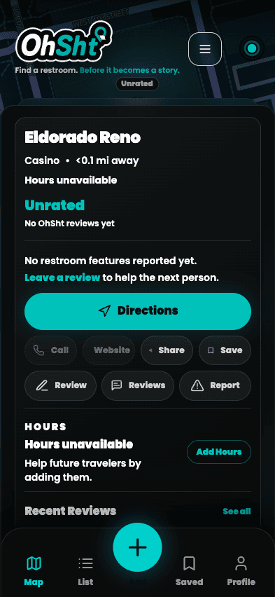
Map, list, detail, and Find One Now were designed around the fastest useful decision. Ratings, reporting, saved places, and community contributions only appear where they improve the next person’s choice.
Map, list, detail, and Find One Now were designed around the fastest useful decision. Ratings, reporting, saved places, and community contributions only appear where they improve the next person’s choice.



PRODUCT PRINCIPLE
Make the urgent thing feel obvious.
Make the urgent thing feel obvious.
LIVE INTERFACE