CLIENT BRAND / LOCAL SERVICE BUSINESS
BIGFISH
LAWN CARE

LOCAL, BUT NOT SMALL
A practical identity system that gives a new lawn-care business instant personality and stays readable everywhere customers actually see it.
THE PROJECT
THE PROJECT
BigFish Lawn Care came in as a local startup ready to make a clean first impression.
BigFish Lawn Care came in as a local startup ready to make a clean first impression.
BigFish Lawn Care came in as a local startup ready to make a clean first impression.
Logo design, visual identity, apparel and signage direction, web direction, and small-business marketing assets.
Logo design, visual identity, apparel and signage direction, web direction, and small-business marketing assets.
A playful, high-impact logo and clear visual system give the business instant personality while staying simple enough for signs, shirts, vehicle graphics, and digital use.
A playful, high-impact logo and clear visual system give the business instant personality while staying simple enough for signs, shirts, vehicle graphics, and digital use.
THE BRAND KIT
THE BRAND KIT
BOLD LOGOMARK, RECOGNIZABLE COLOR PALETTE, READABLE TYPOGRAPHY, APPAREL AND SIGNAGE APPLICATIONS, WEBSITE DIRECTION, AND FLEXIBLE PRINT/DIGITAL BRAND ASSETS.
BOLD LOGOMARK, RECOGNIZABLE COLOR PALETTE, READABLE TYPOGRAPHY, APPAREL AND SIGNAGE APPLICATIONS, WEBSITE DIRECTION, AND FLEXIBLE PRINT/DIGITAL BRAND ASSETS.
BOLD LOGOMARK, RECOGNIZABLE COLOR PALETTE, READABLE TYPOGRAPHY, APPAREL AND SIGNAGE APPLICATIONS, WEBSITE DIRECTION, AND FLEXIBLE PRINT/DIGITAL BRAND ASSETS.
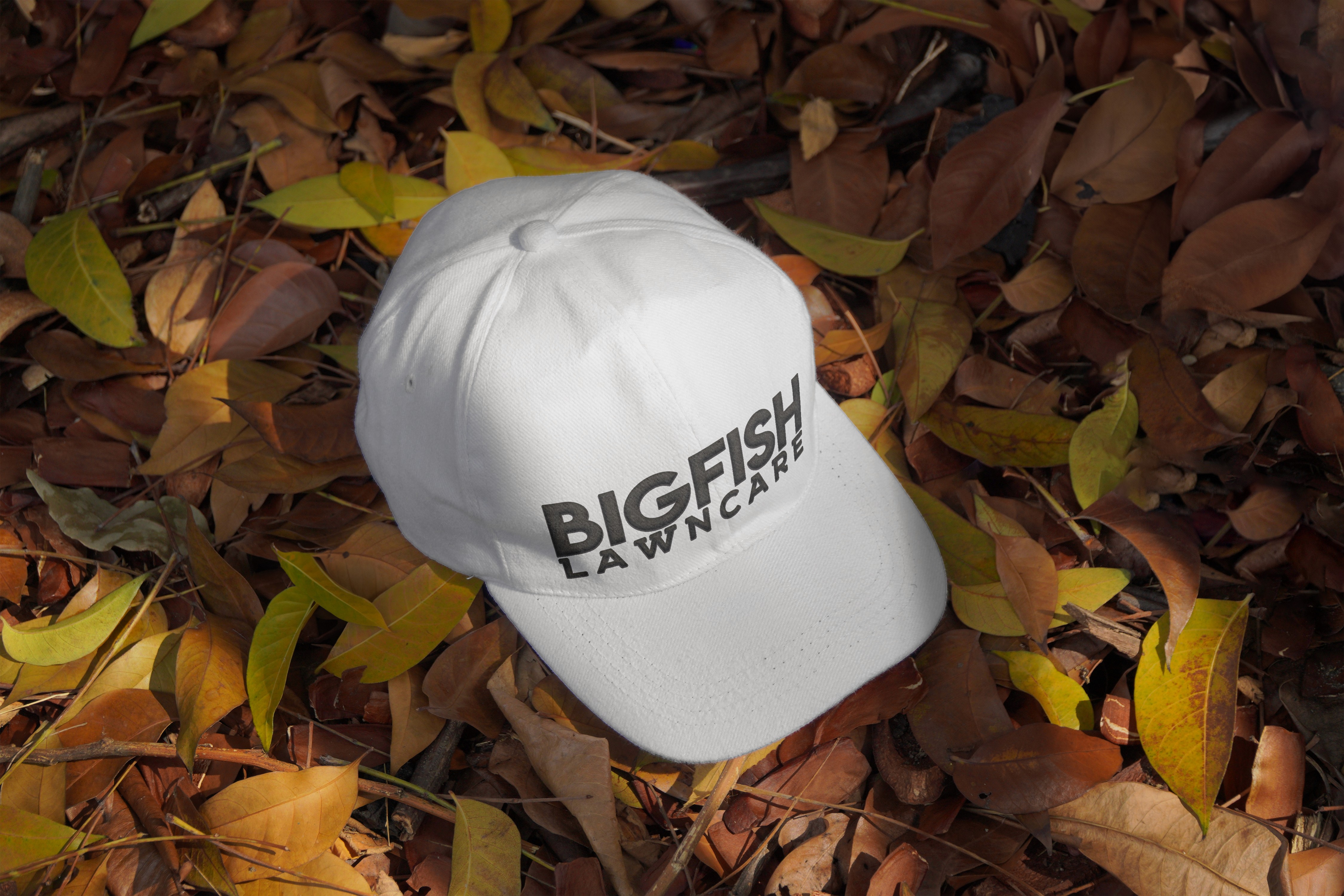

BUILT FOR REAL SERVICE TOUCHPOINTS
Recognition had to happen at a glance.
Recognition had to happen at a glance.
Recognition had to happen at a glance.
The bold mark and tight palette were designed for yard signs, apparel, flyers, social graphics, and a moving vehicle — clear enough to reproduce cheaply and distinctive enough to remember after the truck is gone.
The bold mark and tight palette were designed for yard signs, apparel, flyers, social graphics, and a moving vehicle — clear enough to reproduce cheaply and distinctive enough to remember after the truck is gone.


PRODUCTION NOTE
BigFish Lawn Care came in as a local startup ready to make a clean first impression.
BigFish Lawn Care came in as a local startup ready to make a clean first impression.